• Home
  • Shop
  • Stitch Showcase
  • Embroidery tips
  • Freebies
  • About
  • Contact
Menu

Embellished Elephant

  • Home
  • Shop
  • Stitch Showcase
  • Embroidery tips
  • Freebies
  • About
  • Contact
A picture of an abstract embroidery stitched in different shades of blue. Overlaid is a blue square with white text saying - hand embroidery, how to explore colours in your embroidery, www.embellishedelephant.co.uk

How to explore colours in your embroidery

November 16, 2022

My favourite colour is blue. I see subtleties in shades of blue that I just don’t see in other colours.My craft stash reflects this, I have more yarn, thread and beads in blue than almost any other colour. I know what blues go well with each other and what don’t. But I just don’t have that same sense with other colours. 

Over the past few years as I’ve been creating designs for Embellished Elephant and also pieces for myself I’ve noticed some approaches that I’ve used that have helped me explore colour in a different way.

Set a challenge

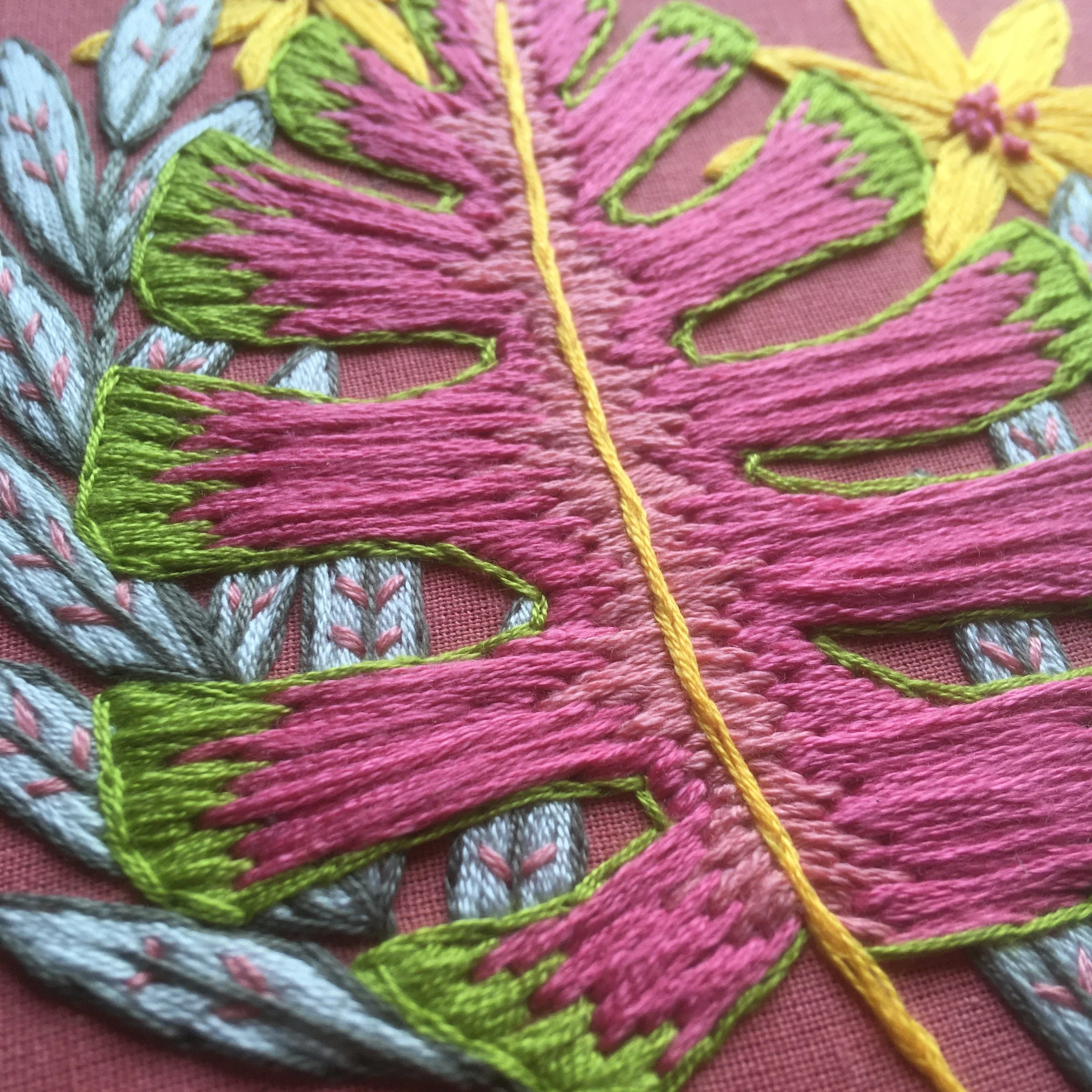
I design and stitch a seasonal floral embroidery pattern that is released on my newsletter each month (Sign up here  to get it delivered directly to your inbox). I am therefore working on subjects that are based on a range of different colours (imagine if I only released patterns of blue flowers!) This has meant that I’m working much more with shades of yellow, pink, purple and green and I’m starting to appreciate these colours, shades and learn how to combine them together.

Work intuitively

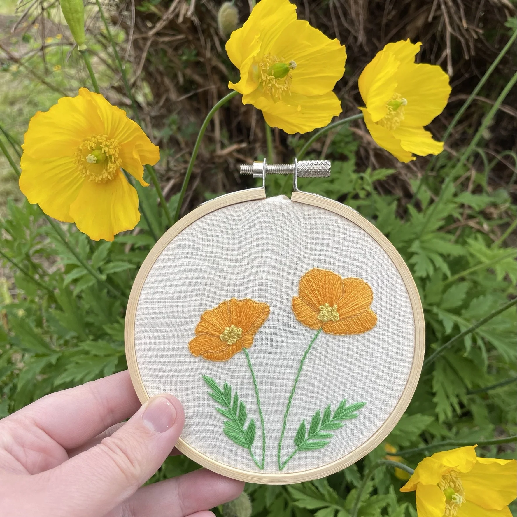
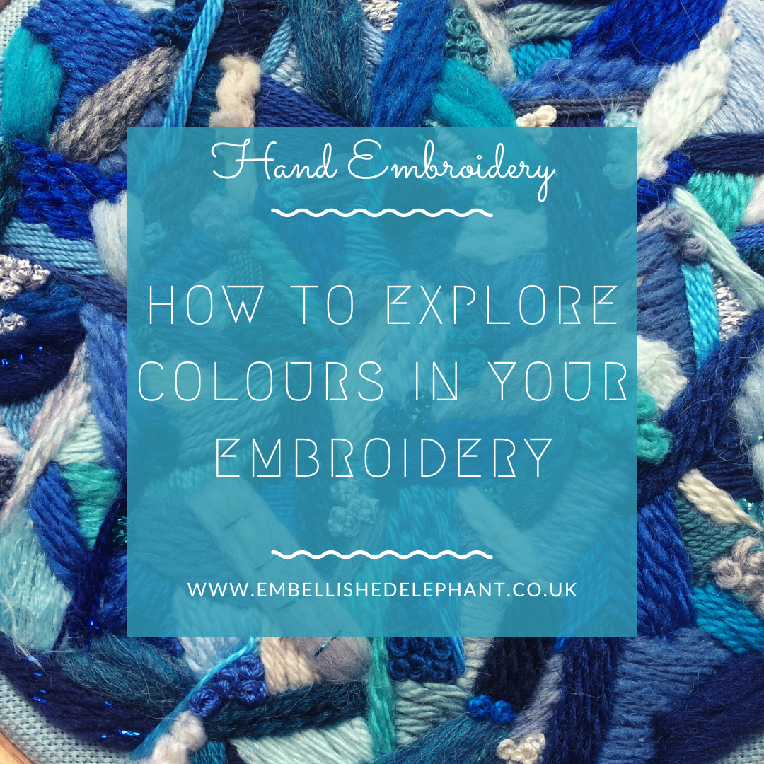
One of my favourite styles of embroidery when I want to stitch a personal project is intuitive embroidery. With this approach you pick out a palette of coloured thread and pick a colour almost at random and stitch where you feel is right. Working with a multicolour palette really teaches you things like complimentary colours that you could learn about in colour theory but is much more fun if you can experiment and practice for yourself. This approach also works with a monochrome palette as you can really start to hone in on what shades sit well with each other and which are more jarring. The picture above is a piece stitched in an intuitive style.

Stitch a range of designers

Different embroidery designers have different approaches to colour. Some favour bold and bright, others pastels. Some pick colours as close as possible to the subject of their embroidery and others will go off piste and stitch leaves in colours like blue or pink.

Stepping into the shoes of another embroidery artist gives you a sense of how they’ve put their colour palette together and why it works.  


Enjoyed this blog post? I share embroidery tips and a free embroidery pattern in my monthly newsletter. Sign up here to receive the newsletter on the 1st of each the month.

In tips 3 Tags colour
Comment
An image of yellow craft supplies in a flat lay on a yellow background. Overlaid is a blue square with white text saying - hand embroidery, finding the right yellow, www.embellishedelephant.co.uk

Finding the ‘right’ yellow

October 5, 2022

In the late spring I feel like I’m surrounded by yellow. Being in the North East of England, everything is a bit delayed in coming into bloom so the daffodils last well past March and the forsythia and pyracanthas also seem to be everywhere. If I venture for a walk down into the nature reserve then a carpet of primroses greets me.

As I was working on my honeysuckle pattern, it took me a long time to find the ‘right’ combinations of yellows and greens to make the embroidery look how I’d imagined it to be in my head.

But honeysuckle (and many other flowers) come in a range of colours and shades. And as a piece of artwork, you don’t have to have the ‘right’ colour unless you are trying to create something photoreal.

In the end I figured out it was the green, not the yellow I’d chosen for the honeysuckle pattern that was throwing off the combination. Whilst I select my colour palette before I start stitching, I find it is only when I stitch the threads next to each other that I can really tell if the colours are working together or not. Sometimes colours that look jarring next to each other can with the addition of other colours sit in harmony. But at other times, there is no rescuing the situation and those stitches need to be cut out and an alternative approach tried.

It was only after I finished stitching the sample of the honeysuckle pattern that I picked up my copy of Colour Confident Stitching by Karen Barbé and realised why the initial combination I’d chosen felt so wrong. It’s a wonderful book for anyone interested in creating their own embroideries and putting together wonderful colour palettes as part of the creative process.

I particularly love these words that she wrote in the introduction as someone with no formal training in art and colour:

“...Colour is a skill that can be learned. It does not matter how many times you feel you have failed in the past when choosing colours. We all have the potential to shine just by learning the process and putting it into practice.”

One thing I have learned in the years since I started embroidering is that colours look different depending on what you surround them with and how much of each colour you use. My Daffodil, Primrose and Honeysuckle patterns all use the same bright and light yellow shade of thread.

Enjoyed this blog post? I share embroidery tips and a free embroidery pattern in my monthly newsletter. Sign up here to receive the newsletter on the 1st of each the month.

In tips 3 Tags colour
Comment
A picture of a plastic thread box with lots of different green embroidery threads wound onto bobbins. Overlaid is a blue square with white text that says - hand embroidery, how to pick a colour palette for embroidery, www.embellishedelephant.co.uk

How to pick a colour palette for embroidery

June 29, 2022

With my kits I pick the colour palette for you. When I do this I aim to pick colours that come mostly from the threads that I stock, this helps reduce the amount of different colours I need to hold to fulfil kit orders. Where I can’t find the right shade (it’s always the green that isn’t quite right!) I look to my wider thread stash and thread cards to pick the perfect colour.

With my free patterns, I provide the design and leave the stitch and colour choices to you. I do this for two reasons firstly, I want you to feel like you can make those creative choices for yourself. I know this isn’t how everyone likes to work but the option is there for you to try. Secondly, if you do want a little more support and guidance and to benefit from my stitch and colour expertise then I offer this detail in the paid for version of the pattern.

Here are a few tips to pick a colour palette for your embroidery:

A picture of a Welsh poppy embroidery in an embroidery hoop held in from of three yellow Welsh poppies.

1. Start from real life

When I’m designing patterns I use photos to guide me on form and colour choices. Quite often flora come in different colour variations and I pick the colour that I love the most (or have the best thread match for). In the case of these Welsh poppies I went for a slightly more orange colour as that is a variation I had come across and I preferred it to the yellow.

A picture of an embroidery of three variegated purple crocuses. There is a green background and to the left of the hoop is a pair of stork scissors and to the right a bundle of colourful threads

2. Look at how you can combine colours

When I originally stitched the crocus pattern I stitched in solid purple and knew it didn’t look right so I experimented with adding a darker purple which helped to define the individual petals better. I also combined one thread of yellow with one of orange for the centre of the crocus as neither colour on their own was quite right.

A close up picture of an abstract embroidery featuring a monstera leaf. The leaf has a yellow stem, pink inner sections and light green leaf tips

3. Go abstract

You don’t have to use real life colours when picking your colour palettes. A great example of this is this piece I stitched from a kit by Lucy Freeman.

This is obviously a monstera leaf but the traditional greens have been replaced with pinks and greys.

Enjoyed this blog post? I share embroidery tips and a free embroidery pattern in my monthly newsletter. Sign up here to receive the newsletter on the 1st of each the month.

In tips 3 Tags colour
Comment

Tags

  • About me
  • Artists/Designers
  • Basics
  • Christmas
  • colour
  • Couching Stitch
  • Fabric
  • Filling Stitch
  • Finishing
  • Hoops
  • Isolated Stitch
  • Line Stitch
  • London
  • My Makes
  • Needles
  • Stitch Showcase
  • Texture Stitch
  • Thread
  • Transfer
  • Travel

Latest Posts

Featured
May 1, 2025
How to manage your backlog of craft projects
May 1, 2025
May 1, 2025
Apr 1, 2025
What to do if you don't like what you've stitched
Apr 1, 2025
Apr 1, 2025
Feb 15, 2025
How to decide which embroidery stitch to use
Feb 15, 2025
Feb 15, 2025
Feb 1, 2025
Focus on stitches for flowers
Feb 1, 2025
Feb 1, 2025
Jan 1, 2025
Focus on stitches for leaves
Jan 1, 2025
Jan 1, 2025
Nov 1, 2024
Stitch Showcase: Six-pointed star stitch
Nov 1, 2024
Nov 1, 2024
Oct 1, 2024
Focus on transferring or tracing patterns
Oct 1, 2024
Oct 1, 2024
Sep 1, 2024
Focus on hoops
Sep 1, 2024
Sep 1, 2024
Aug 1, 2024
A focus on needles
Aug 1, 2024
Aug 1, 2024
Jul 1, 2024
Focus on threads
Jul 1, 2024
Jul 1, 2024

Home — Shop — Stockists — Wholesale — Portfolio — Contact — Reviews — Policies — FAQs