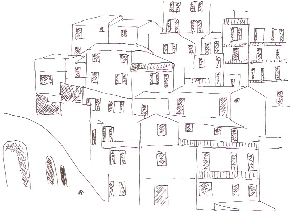
Module 2 of my City & Guilds course was a pure design module, not a stitch in sight. A lot of the work I’ve done in the past has either been intuitive or I have a very clear idea in my head and I experiment until I achieve the desired effect. Therefore sitting down and designing something from scratch for no purpose other than to create a design was alien to me.
However, we were guided through the process starting with selecting a theme and four photos on that theme. The theme I chose was ‘blocks’.
Clockwise from top left: Cinque Terre near Genoa, wall of Suomenlinna fort near Helsinki, Temple ruin near Angkor Wat, exhibit in Pergammon Museum in Berlin
We then traced elements of those photos and repeated those elements to further the designs. I started off using pen and paper but I found a great app on my iPad that allowed me to trace the photo electronically which gave a much more polished and professional look.
Below are some of the favourite of the designs I created for this module.


